SuperHuman App STYLE GUIDE-
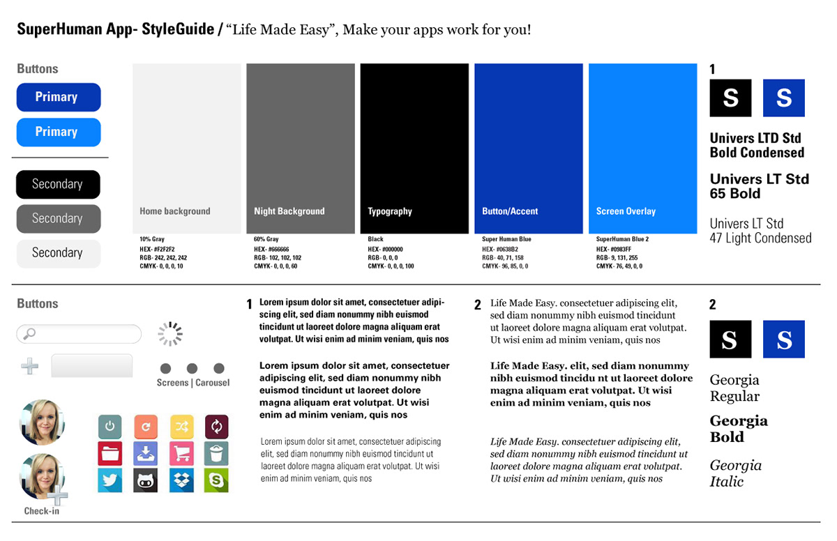
For the style guide of the "SuperHuman" app I chose colors that were gender neutral and reflect a business aspect. For the fonts I chose a serif and sans serif font. The fonts complement each other and should allow for browser accessibility.
For the icons, I indicated how large the apps should display on the "dashboard." The dashboard could have as many applications as the user would like so I tried to keep the icons relatively small. The login/check-in areas would feature the user's face. On the splash/home screen the user could use fingerprint technology to login.
Overall, the style guide would change depending on browser/smart phone capabilities. When working with a real life programmer these aspects would be taken into consideration.