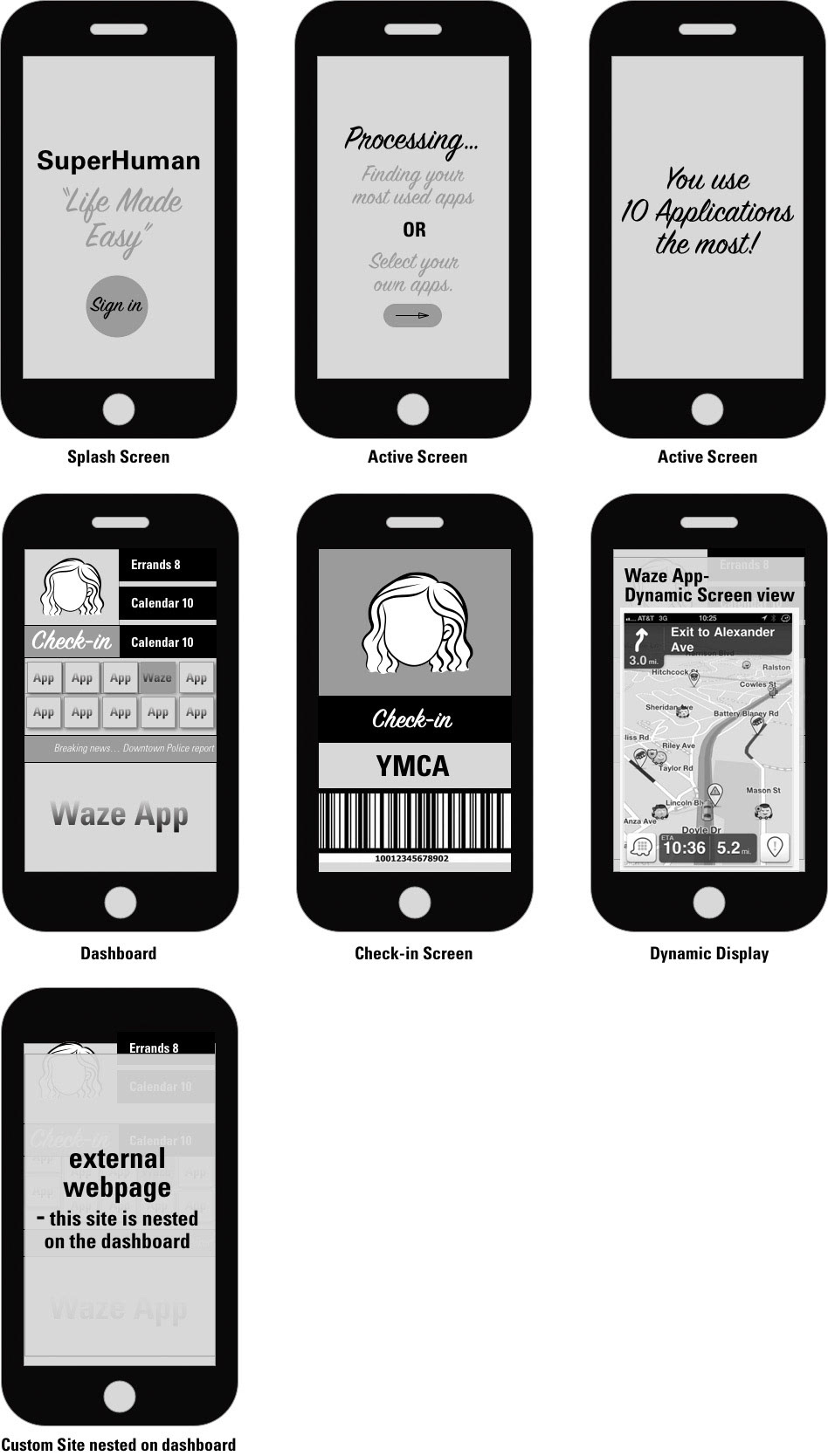
SuperHuman App Wire-frames-
The wire-framing process became much easier after going through the persona and user testing process. Logically, I knew what feedback from the user testing would work best for the wireframes. I concluded that there had to be no more than seven dynamic screens. The splash screen would only appear once for new users and would be easy to pass with fingerprint technology for existing users.
From my user testing I knew that having applications either automated based on daily usage or populated by the user would work best. The automated process would be ideal for a user that is overwhelmed by all the applications on their phone. This route would be best for back end programming to compare all apps and decide which is used most and get rid of the "fat" or underused applications.
The dashboard would have all the applications upfront for the user and allow ease of use. They would be able to check-in to locations, use MVP cards or look through all of their applications on one screen. The SMS messaging option could be for push notifications or notifications from schools, work or significant other.
The dynamic screen could either be viewed on one third of the screen of full screen. The overall goal was to allow the user to take control of their app usage and make them more effective for them on a daily basis.